Web design has moved beyond “pretty.” With the rise of AI-driven browsing, your website isn’t just competing with other sites; it’s competing for the user’s increasingly limited cognitive bandwidth. Leveraging psychological principles, you can craft digital experiences that feel intuitive, trustworthy, and human in an automated world.
1. The ‘Rule of Thirds’ vs. AI Eye-Tracking
The Rule of Thirds remains a cornerstone, but we combine it with Predictive Eye-Tracking.
- The Psychology: Users naturally gravitate toward the intersections of a 3 X 3 grid.
- The 2026 Edge: Use AI heatmapping tools to ensure your most important “Generative UI” elements (like AI chat prompts) sit at these intersections.
- Example: Modern SaaS dashboards now place their “Quick Action” AI hubs at the top-left intersection to match the natural “F-Pattern” of scanning.
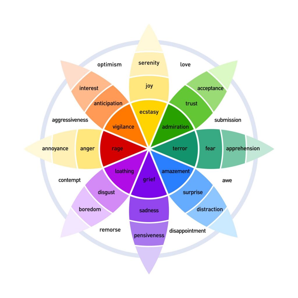
2. Color Psychology & The “Trust Deficit”
With AI-generated deepfakes on the rise, color is now used to signal authenticity.
- The Psychology: Different wavelengths trigger specific amygdala responses. Blue still signals stability, but “Organic Greens” and “Warm Earth Tones” signal human-centric brands.
- The Strategy: Use High-Contrast Urgency (Red/Orange) only for critical errors. For conversions, use “Action Colors” that contrast with your brand’s primary palette to reduce visual noise.
3. Variable Typography & Reading Fatigue
In a world of infinite scrolling, typography is your best tool to fight “Digital Amnesia.”
- The Fact: Serif fonts are making a massive comeback for long-form content because they provide “visual anchors” that improve reading comprehension by up to 15%.
- Tip: Use Variable Fonts that automatically adjust weight and spacing based on the user’s ambient light and device distance.
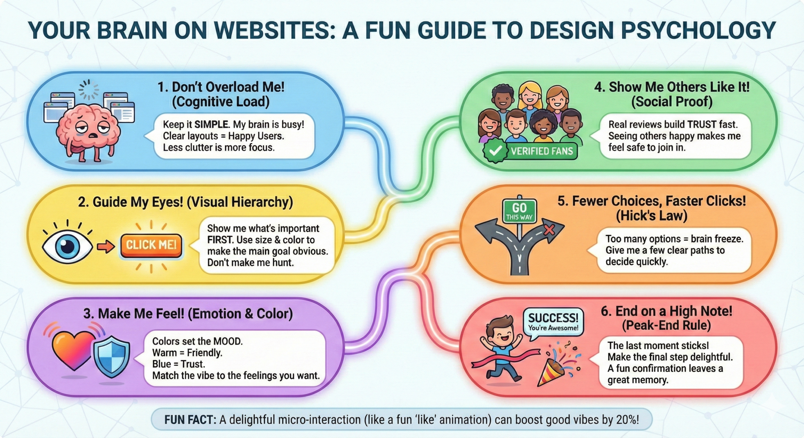
4. White Space as “Cognitive Breathing Room”
White space is no longer just “empty.” It is a structural tool used to lower a user’s cortisol levels.
- The Psychology: Cluttered designs trigger a “fight or flight” response, leading to high bounce rates. Ample negative space allows the brain to categorize information faster.
- Example: Apple’s 2026 product pages use nearly 60% negative space, forcing the user’s brain to focus exclusively on the product’s value proposition.
5. The ‘Peak-End Rule’ in Micro-Interactions
Users don’t remember your whole site; they remember the “vibes” of the most intense moment and the very last second.
- The Strategy: Ensure your “Peak” (the value delivery, like a successful search) and your “End” (the confirmation page) have delightful animations or personalized “thank you” notes.
- The 2026 Goal: Make the logout or “Task Complete” animation the most satisfying part of the UI.
Love this graphic? Share it on your site!
(Copy the code below to embed with a link back to the full guide)
6. Visual Hierarchy & The “Bionic Reading” Trend
Visual hierarchy tells the user’s brain what to care about first.
- The Fact: Use Depth Perception (z-axis) as much as size. Using subtle shadows and layers (Neumorphism 3.0) helps users understand which elements are interactive vs. informational.
- Tip: Your H1 should not just be big; it should be the most visually distinct element on the page.
7. Hick’s Law in the Age of “Choice Overload”
Hick’s Law states: T=b 2(n + 1). The time (T) to make a decision increases with the number of options (n).
- The 2026 Strategy: Use “Progressive Disclosure.” Don’t show all 20 features at once. Show the top 3 and hide the rest behind an “Advanced” toggle.
- Why? It prevents Decision Paralysis, a major cause of cart abandonment.
8. LCP and the “Impatient User” Threshold
The psychological “wait limit” has dropped. If your Largest Contentful Paint (LCP) is over 1.2 seconds, the user’s brain has already mentally “switched off.”
- The Psychology: Slow speeds signal a lack of technical competence, which directly destroys brand trust.
- Tip: Prioritize “perceived performance.” Use skeleton screens to show the user that content is coming, even before it’s fully loaded.
9. Social Proof 2.0: Authenticity Over Volume
Generic testimonials are dead. Users look for Verified Interaction Signals.
Strategy: Integrate third-party trust badges (like Trustpilot or Google Reviews) directly into your CTA buttons.
The Fact: Video testimonials and “Live Activity” feeds (e.g., “5 people in New York just booked this”) carry 3x more psychological weight than written quotes.
Conclusion
Understanding the psychology behind a screen is what separates a good website from a high-converting digital ecosystem. Design isn’t just about what looks pretty in a portfolio; it’s about respecting the human brain’s limits and tapping into its natural habits. By mastering these 9 principles—from the “breathing room” of white space to the decision-saving power of Hick’s Law—you aren’t just building a site; you’re building a relationship with your users.
As AI continues to automate much of our digital world, the most successful websites won’t be the ones with the most “perfect” layouts. They will be the ones that feel the most human. Don’t be afraid to break a “rule” if it means showing more personality or solving a customer’s problem in a way that feels uniquely yours. Psychology gives us the roadmap, but your brand’s heart is what keeps people coming back.
Read more on our Design page!